|
|
Other Works
9th Annual Photo Contest, Vancouver, Canada, 2015
|
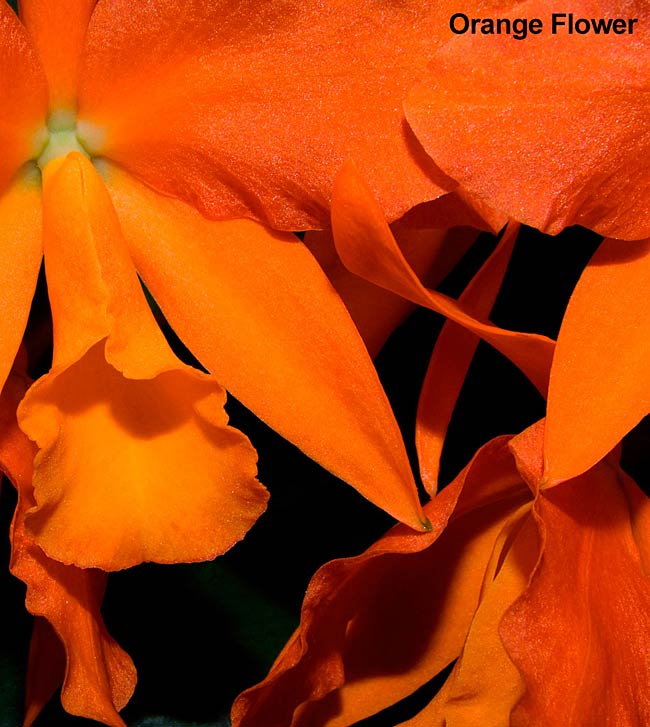
Nafiseh Tabari
Title: Orange Flower
|
|
|
| Jurors |
Scores |
Critiques |
| Wes Bergen |
7 |
Stunning colour. In spite of having reasonably good depth of field, there is very little detail and texture in the flower. I suspect this is partially due to flat lighting, but more from over-saturation. Composition is not very strong – I find the trumpet shape on the left most interesting, but poorly positioned.
|
| | | |
| Allen Bargen |
6 |
A macro or close up of this flower delivers a soft image throughout. The orange tones are vibrant and the flower is nicely placed at top left. The petals at the top blend together in one mass that dominate the top of the image significantly.
|
| | | |
| Lynne Kelman |
5 |
Sometimes it is better to concentrate on less rather than more when composing. Selecting one frond or perhaps just the trumpet shape in the flower would have been more striking and pleasing to the eye. This image suffers because it is too busy---but colour is handled well and looks natural. |
| | | |
| Total Score: |
18 |
|
| | | |
|
Return to Contest Page
Top
|


